
Design Ideas
Matching Blinds to Wall Paint: Colour Combinations That Work
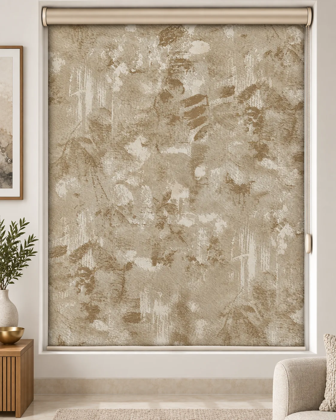
Match the blind to the wall and the window disappears. Contrast it and the window becomes art.
Choosing a blind colour is easiest when you start from the walls. The question is simple: do you want the window to blend into the wall, or stand out as a feature? Both can look great. Here is how to decide, with combinations that work in Indian homes.
Approach 1: Tone-on-tone (blend in)
Choose a blind a shade lighter or darker than the wall in the same colour family. The window recedes, the room feels calm and larger. This suits small rooms, bedrooms and minimalist interiors.
- Off-white walls with ivory blinds.
- Light grey walls with soft grey blinds.
- Beige walls with sand or oatmeal blinds.
Approach 2: Soft contrast
Choose a blind noticeably different from the wall but harmonious. The window is defined without dominating.
- White walls with greige or stone blinds.
- Pale blue walls with warm grey blinds.
- Sage green walls with ivory or oatmeal blinds.
- Warm beige walls with taupe blinds.
Approach 3: Bold contrast
A dark or vivid blind against light walls makes the window a feature. Works in living rooms, dining areas and modern spaces.
- White walls with charcoal or navy blinds.
- Light walls with terracotta or olive blinds.
- Grey walls with mustard or deep teal blinds.
Read dark colour blinds before going very dark on sunny windows.
Accent walls
If the window sits on an accent wall (say, deep green or wallpaper), choose a neutral blind that does not compete — ivory, stone or a colour pulled from the wallpaper. If the accent wall is elsewhere, the blind can echo its colour for a connected look.
Consider the floor and furniture too
Walls are only part of the picture. Warm wooden floors and brown furniture suit warm blinds; grey tiles and modern furniture suit cool tones. Read neutral colour blinds.
Light changes everything
Paint and fabric look different in morning sun, afternoon glare and evening lamps. Always compare blind samples against the actual wall at different times. A colour that matches in daylight may look different at night. See how to judge fabric before buying.
Window frames matter
White frames suit almost any blind. Dark frames (black, bronze, wood) suit blinds that either match the frame or the wall. A black frame with a charcoal blind looks seamless and modern.
Practical considerations
- Sunny windows: choose fabrics with a light back regardless of the room-side colour.
- Dusty rooms: mid-tones hide dust better than white.
- Rooms with several windows: one blind colour for all.
Room-by-room suggestions
- Living room: soft contrast — greige zebra on white walls.
- Bedroom: tone-on-tone — warm grey blackout roller on light grey walls.
- Kids’ room: a cheerful soft colour against white.
- Study: calm contrast — sage or navy on light walls.
Cost
Colour choice rarely affects price much; fabric type does. Rollers run ₹100–₹250 per sq ft and zebras ₹120–₹190, GST included, with a 3-year warranty. Our full colour guide for Indian homes has more combinations.
Testing before ordering
- Tape samples to the wall next to the window.
- Look in the morning, afternoon and evening.
- Step back to see them from across the room.
- Choose the one that looks right at night — when most people use the room.
When in doubt, choose a calm tone that suits the wall and let cushions or art carry the bolder colour.
Repainting later
If you repaint often, neutral blinds give the most freedom — they will suit a new wall colour without needing replacement.
FAQs
Should blinds be lighter or darker than walls?
Either works. Lighter keeps the room airy; darker adds definition.
Can blinds match curtains instead of walls?
Yes — if you layer curtains, coordinate blind and curtain first, then check against the wall.
Not sure of your sizes?
Read our measuring guide or try the AR self-measure tool to get exact numbers.